Answers on the Method of Least Squares
1 Problem 1: Regression Line for Population growth
Population of a city was measured throughout 10 years and the measured data is given in the following table:
\[ \begin{array}{|c|c|} \hline \textbf{Year} & \textbf{Population (million)} \\ \hline 1 & 47.5 \\ 2 & 55.0 \\ 3 & 65.2 \\ 4 & 69.9 \\ 5 & 80.9 \\ 6 & 88.5 \\ 7 & 92.7 \\ 8 & 100.4 \\ 9 & 105.6 \\ 10 & 110.9 \\ \hline \end{array}\ \]
The graph of this data is shown in the figure below. Find (i) the regression line of this data using the least squares solution and (ii) the least squares error.
Let \[ A = \begin{pmatrix} 1 & 1 \\ 1 & 2 \\ 1 & 3 \\ 1 & 4 \\ 1 & 5 \\ 1 & 6 \\ 1 & 7 \\ 1 & 8 \\ 1 & 9 \\ 1 & 10 \\ \end{pmatrix}, \boldsymbol{y} = \begin{pmatrix} 47.5 \\ 55.0 \\ 65.2 \\ 69.9 \\ 80.9 \\ 88.5 \\ 92.7 \\ 100.4 \\ 105.6 \\ 110.9 \\ \end{pmatrix} \].
1.2 Task 1.1: Input Data
A = matrix(c(1,1,1,2,1,3,1,4,1,5,1,6,1,7,1,8,1,9,1,10), ncol = 2)
y = matrix(c(47.5,55.0,65.2,69.9,80.9,88.5,92.7,100.4,105.6,110.9), ncol = 1)
# Print results
print("A:")## [1] "A:"## [,1] [,2]
## [1,] 1 1
## [2,] 1 6
## [3,] 1 1
## [4,] 2 7
## [5,] 1 1
## [6,] 3 8
## [7,] 1 1
## [8,] 4 9
## [9,] 1 1
## [10,] 5 10## [1] "y:"## [,1]
## [1,] 47.5
## [2,] 55.0
## [3,] 65.2
## [4,] 69.9
## [5,] 80.9
## [6,] 88.5
## [7,] 92.7
## [8,] 100.4
## [9,] 105.6
## [10,] 110.91.3 Task 1.2: Compute A^T A and A^T y
## [1] "A^T A:"## [,1] [,2]
## [1,] 60 135
## [2,] 135 335## [1] "A^T y:"## [,1]
## [1,] 1808.3
## [2,] 3931.81.4 Task 1.3: Perform row reduction using pseudo-inverse (similar to ginv in R)
## [1] "Least squares solution:"## [,1]
## [1,] 39.9933
## [2,] -4.38001.5 Task 1.4: Find an augmented matrix for row reductioned_echelon)
augmented_matrix = cbind(AtA,AtY)
# Reduced echelon form (approximate using NumPy's matrix rank functions)
reduced_echelon <- rref(augmented_matrix)
# Print results
print("The augmented matrix is:")## [1] "The augmented matrix is:"## [,1] [,2] [,3]
## [1,] 60 135 1808.3
## [2,] 135 335 3931.8## [1] "And its RREF is:"## [,1] [,2] [,3]
## [1,] 1 0 39.99333
## [2,] 0 1 -4.380001.6 Task 1.5: Solve for regression coefficients (beta)
beta = ginv(A)%*%y
# Regression equation: y = beta[0] + beta[1] * x
print(paste0("Regression equation: y = ",round(beta[1], 4)," + ",round(beta[2], 4), "x"))## [1] "Regression equation: y = 39.9933 + -4.38x"1.7 Task 1.6: Find the residual error \(e\)
# Compute predicted values
y_pred = A %*% beta
# Compute residuals
residuals = y - y_pred
# Compute least squares error
lse = sqrt(sum(residuals^2))
# Print least squares error
print(paste0("Least squares error: ",round(lse, 4)))## [1] "Least squares error: 125.7789"1.8 Task 1.7: Visualize the result
library(ggplot2)
# Create data frame with age and height data
data = data.frame(
"Year"= seq(1,10),
"Population"= y
)
# Fit a linear regression model
model <- lm(Population ~ Year, data = data)
# Predict values for regression line
X_range <- seq(1, 10, length.out = 100)
y_pred <- predict(model, newdata = data.frame(Year = X_range))
# Plot the data and regression line
ggplot() +
geom_point(data = data, aes(x = Year, y = Population, color = "Data Points")) +
geom_line(aes(x = X_range, y = y_pred, color = "Regression Line")) +
scale_color_manual(values = c("Data Points" = "blue", "Regression Line" = "red")) +
labs(title = "Plot of Population Data",
x = "Year",
y = "Population (Million)",
color = NULL) +
theme_minimal() +
theme(legend.position = "top")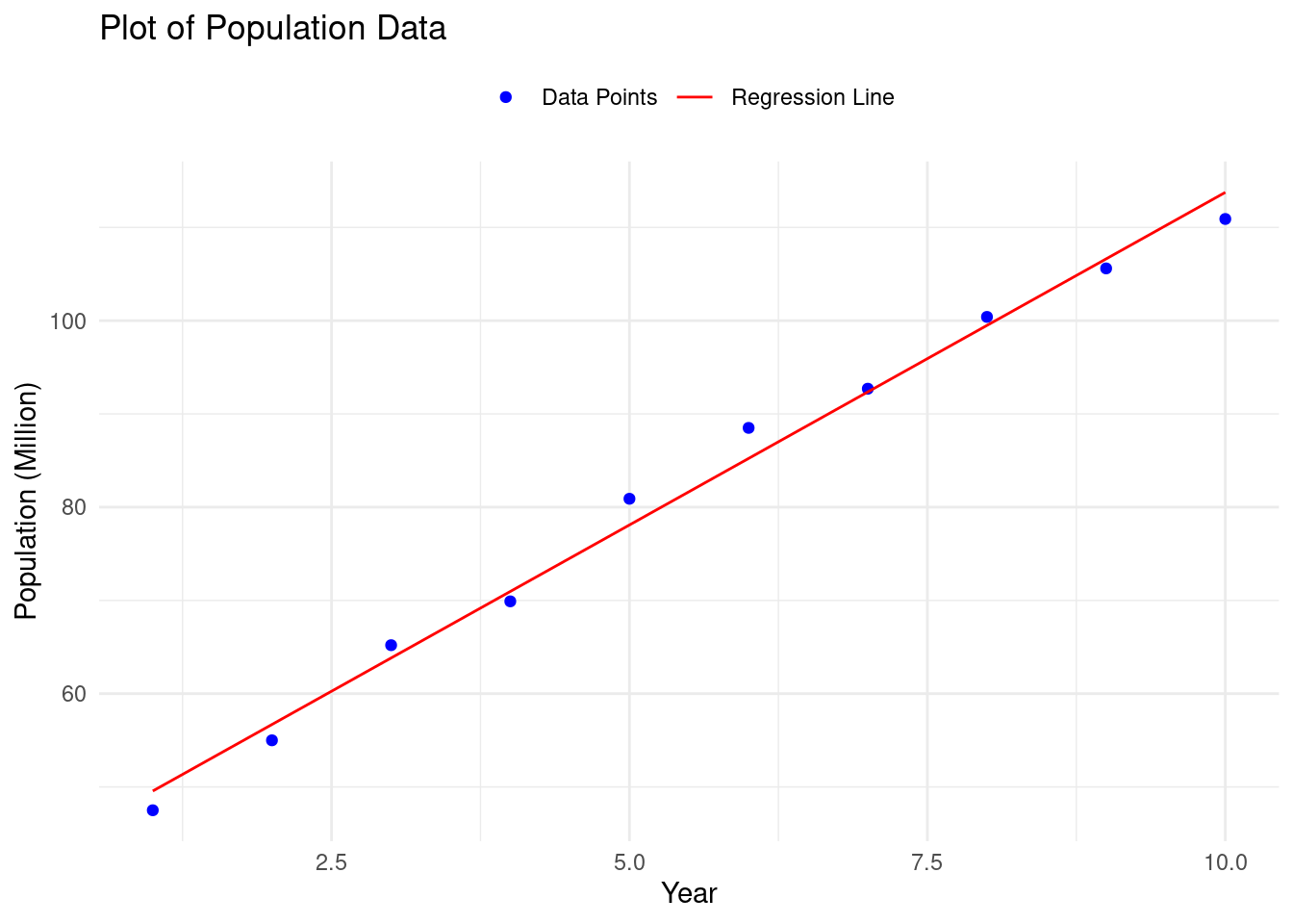
2 Problem 2: Finding the Quadratic Polynomial Best Fit
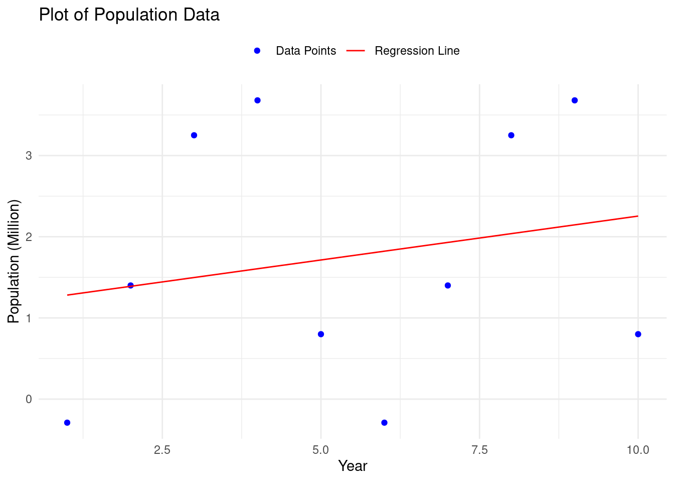
Find the quadratic polynomial \(f(x)\) which is the best fit to the five points \[(1.95, -0.29), (2.26, 1.40), (2.70, 3.25), (4.14, 3.68), (4.86, 0.80). \] Set \[ A = \begin{pmatrix} 1 & 1.95 & 1.95^2 \\ 1 & 2.26 & 2.26^2 \\ 1 & 2.70 & 2.70^2 \\ 1 & 4.14 & 4.14^2 \\ 1 & 4.86 & 4.86^2 \end{pmatrix} \quad \textrm{and} \quad \boldsymbol{y} = \begin{pmatrix} -0.29 \\ 1.40 \\ 3.25 \\ 3.68 \\ 0.80 \end{pmatrix}. \]
2.1 Task 2.1: Implement the code
library(MASS)
library(pracma)
A = matrix(c(1,1,1,1,1,1.95,2.26,2.70,4.14,4.86,1.95^2,2.26^2,2.70^2,4.14^2,4.86^2), ncol=3)
y = matrix(c(-0.29,1.40,3.25,3.68,0.80),ncol=1)
AtA = t(A)%*%A
AtY = t(A)%*%y
least_squares_sol = ginv(A) %*% y
beta = ginv(A)%*%y
# Compute predicted values
y_pred = A %*% beta
# Compute residuals
residuals = y - y_pred
# Compute least squares error
lse = sqrt(sum(residuals^2))2.2 Task 2: Visualize the result
library(ggplot2)

# Create data frame with age and height data
data = data.frame(
    "Year"= seq(1,10),
    "Population"= y
)

# Fit a linear regression model
model <- lm(Population ~ Year, data = data)

# Predict values for regression line
X_range <- seq(1, 10, length.out = 100)
y_pred <- predict(model, newdata = data.frame(Year = X_range))

# Plot the data and regression line
ggplot() +
  geom_point(data = data, aes(x = Year, y = Population, color = "Data Points")) +
  geom_line(aes(x = X_range, y = y_pred, color = "Regression Line")) +
  scale_color_manual(values = c("Data Points" = "blue", "Regression Line" = "red")) +
  labs(title = "Plot of Population Data",
       x = "Year",
       y = "Population (Million)",
       color = NULL) +
  theme_minimal() +
  theme(legend.position = "top")